In conversation with Peter Eckart and Bernd Hilpert of unit-design.
Martin Krautter: Let's start with a provocative question. There are already countless pictogram systems – why does unit-design keep on designing yet more new ones?
Peter Eckart: Pictogram systems have a context in terms of time and, in our work, often in terms of objects as well: a specific building or institution, for example. Standard pictograms are often too unwieldy for such applications.
Bernd Hilpert: Plus, we just enjoy coming up with pictograms. We're not even aiming for a general and definitive system – what we like are characteristic idiosyncrasies.
PE: We also try to incorporate our own design approach to all the abstraction inherent in pictograms. Our designs are supposed to be balanced and in proportion while functioning well in sequences and combinations. This is the kind of work that never ends.

MK: Could you compare it to typography and the diversity among typefaces?
BH: Within the bounds of basic symbolic shapes, there are plenty of possibilities for modulating quality of expression. That's why there are all kinds of pictogram systems, just as with typefaces. Depending on the context, you may want pictograms to be more straightforward – such as at airports, where safety and security are also important – or lighter and more humorous. That doesn't limit function or the ability to recognize the message.
MK: Let's look at the design process. What do typical contexts look like? Who initiates the development of new pictograms?
PE: When projects start, even our customers often know very little about the subject. Many think that a pictogram is just a pictogram. It is down to us to explain the fine distinctions. The development of a pictogram system thus becomes part of the design concept that we put forward.
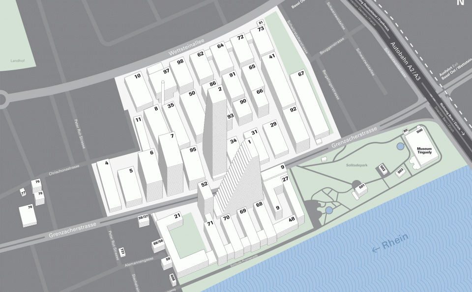
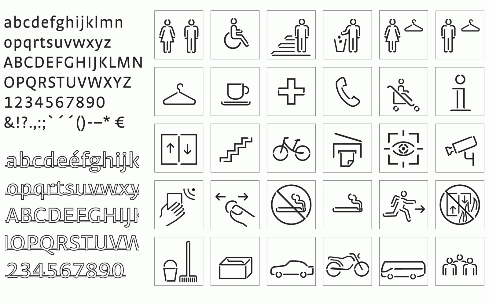
BH: There are also orders for which we develop a pictogram system in line with an existing corporate design. One example is Roche in Basel, for which we designed around 40 pictograms that identify services for employees on company premises – a very specific task and a substantial order, even including evaluation by employees.
PE: Pictograms also play a major role in service design, currently. I can use them to organize and communicate service processes, not just within spaces but also on printed material and websites. Our projects for Fraport, for example, went in this direction.
MK: So what kinds of things can I tinker with when designing a pictogram system?
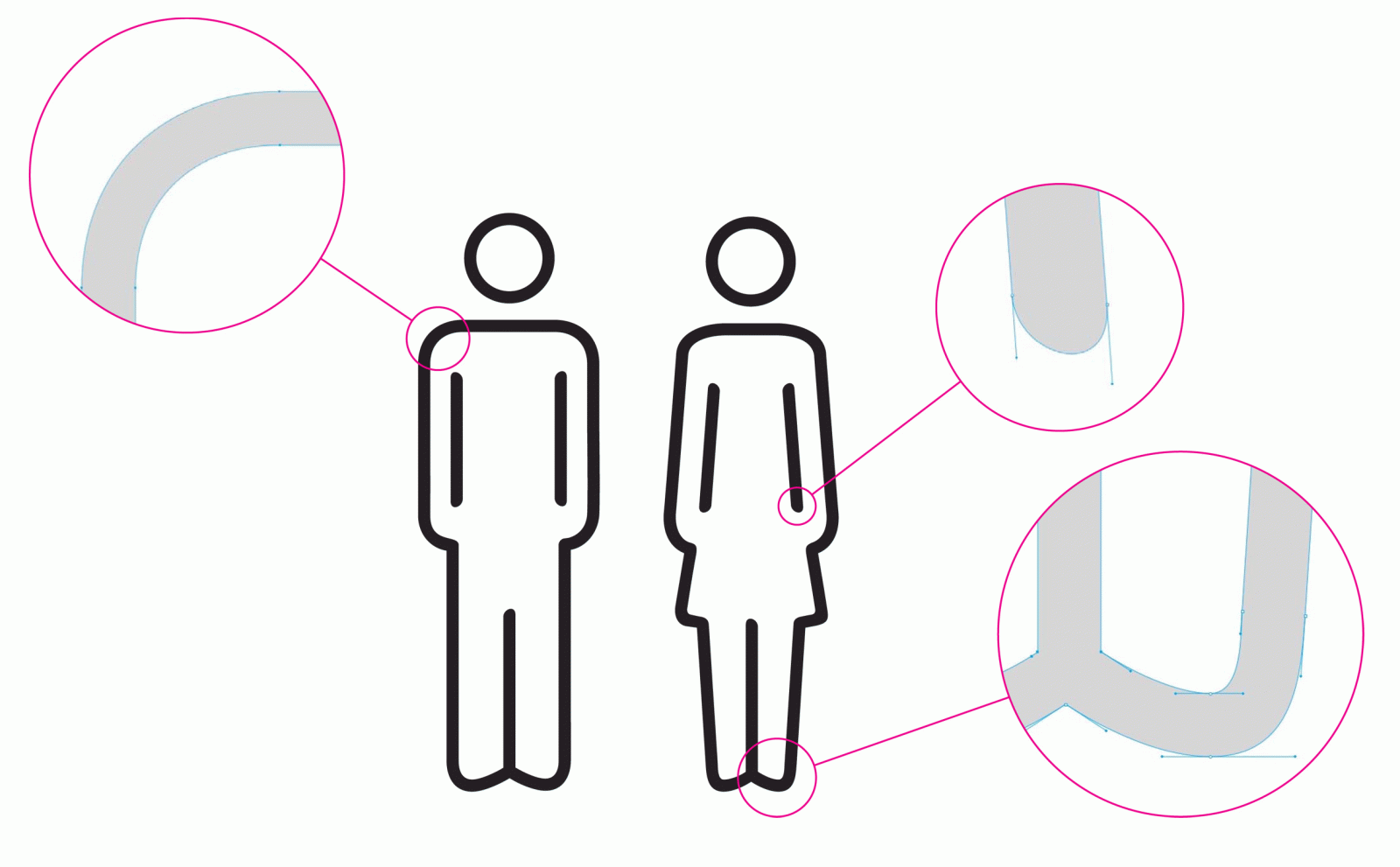
BH: We have three levels of design that need to come together in a good pictogram: psychological perception, semantic quality and aesthetic quality. It all comes down to the details: lines, radii, proportions.
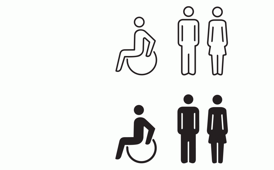
PE: The biggest challenge is using just one or two symbols and their design language to develop a system and a syntax that can be applied to all elements. Let's imagine we've found a coherent, clear shape in the correct proportions for a symbol representing "woman". How do I use the same characteristics to represent a motorcycle?
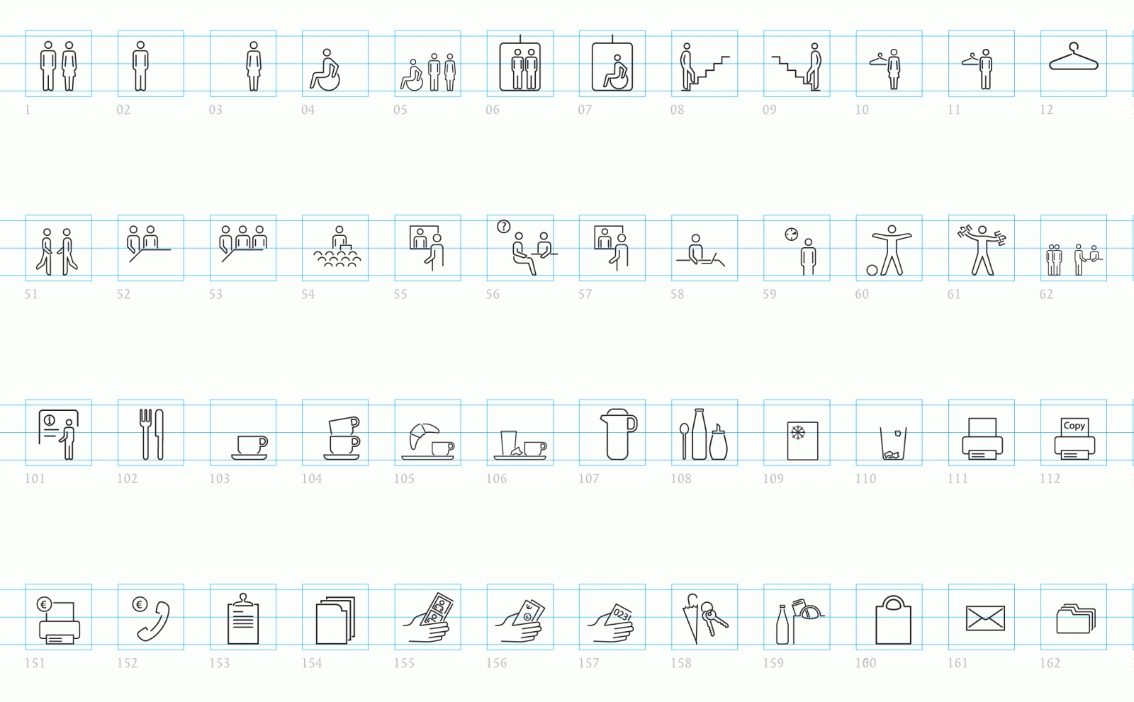
BH: There's also the question of how extensive is the system going to be? How much differentiation is required? The requirements sometimes stray into the realm of the irreconcilable, such as when pictograms are supposed to differentiate between a meeting room and a conference room.
PE: Some interesting questions include, for example, how do I depict men and women from Arab countries? How do I represent wheelchair users or strollers from the front instead of the usual side view? And despite all the simplification of the means of design, the implementation of pictograms in visual media is extremely diverse, from signs in all sizes to animated icons in electronic media.
MK: What are the strengths of pictograms?
BH: In my opinion, it is impossible to overestimate the functional aspect of pictograms. We consistently use pictograms as spatial graphics as well. They work well in a room because they bring a pictorial, narrative quality to communication. It is a more open form of address than through text alone.
PE: Pictograms are a means of establishing direct human contact. I like to compare them to doorknobs or handrails when I'm talking to architects. Guidance systems and their symbols address people as their counterparts, reflecting their images as those that we have provided. This creates dialog that extends beyond a simple sense of space. Direct interaction...
MK: ...that also has a strong emphasis on tonality?
BH: It is about not just functional aspects but also communicative aspects as a whole. Pictograms are also a way of showing your image of people and the way of addressing them that you have chosen.
PE: Despite that, I would say that we naturally take a more functional approach to design – that is a basic requirement.
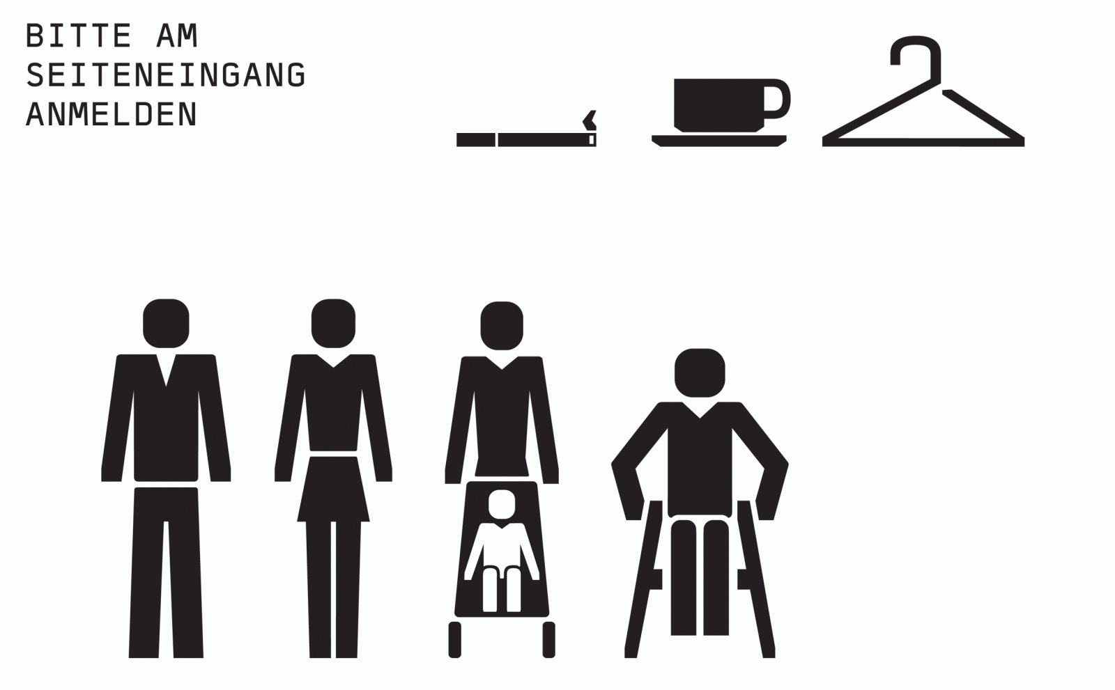
BH: Quite frankly, I don't believe in a lot of what people ascribe to pictograms in terms of functionality. There are 20 symbols at most that people have learned, and that therefore work, all over the world. Unless they have been learned, pictograms are a guessing game. We focus on employing pictograms alongside text wherever possible to facilitate the learning effect, especially in places where people arrive at a location and where there is a lot of visitor traffic. It is important to understand that it is not artistic quality that ensures functionality but cultural transmission. A symbol in the shape of a man could mean anything at first. If it's on a door, the intention is clear. Things become trickier when there's a wheelchair symbol: is this the disabled toilet, or an entrance for wheelchair access? In such cases, we put "WC", "Toilets" etc. in small letters next to the symbol to avoid confusion.
MK: And finally, which design discipline actually involves the skills required to develop such systems? If nothing else, they call for mastery of graphical means of expression.
PE: It's about form and the principles of design, which are really things in which any designer should be proficient, whether in an abstract way on a screen or in a three-dimensional space with plywood and a fretsaw. What is important is being truly willing to grapple with details. It comes down to tenths of a millimeter.
BH: You also need cultural sensitivity, experience and a background in finding the right way of expressing things that people want to be symbolized.
PE: Ultimately, it's all about the interaction between detail and meaning.
Industrial designer by training; blogger avant la lettre for the German Design Council's Euro Design Guide web platform in 1997; responsible for text and content in print and online in corporate communications at ERCO from late 1997 to March 2013, including as community manager for the ERCO Facebook page. Freelance author for brand and corporate communication in Offenbach am Main since April 2013.